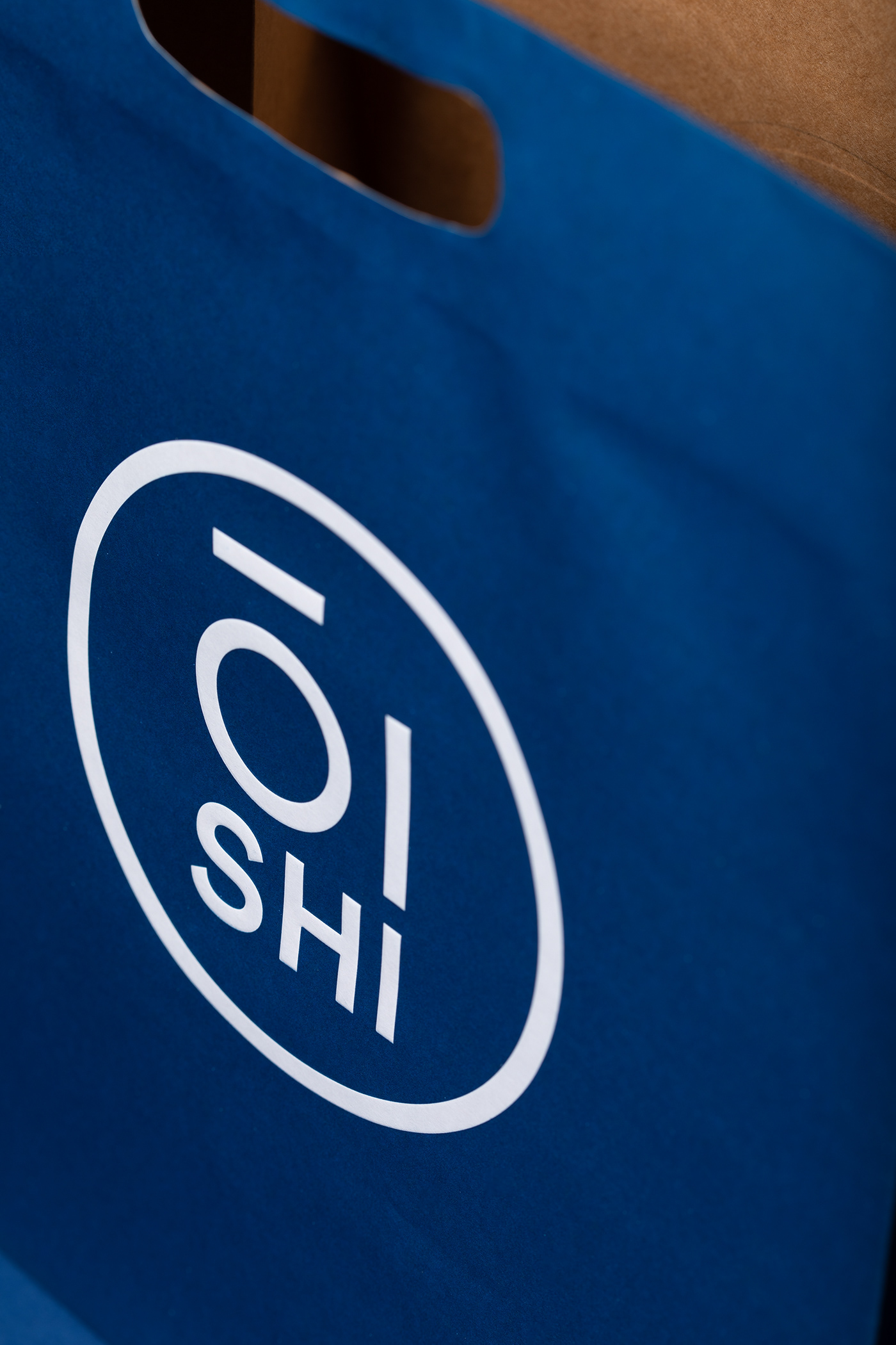
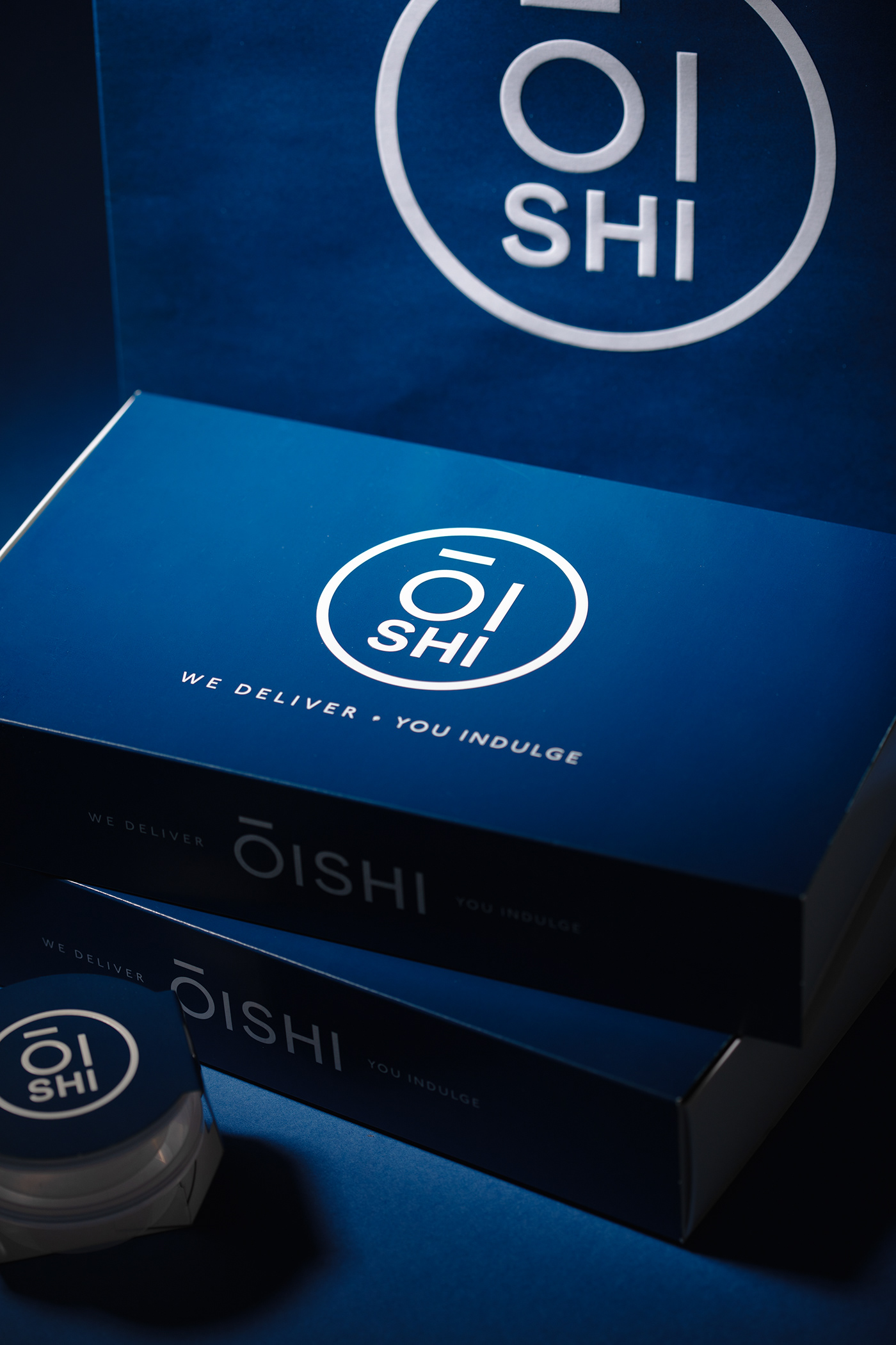
MARK Studio embarked on a transformative journey to reimagine the Oishi brand, elevating its essence while embracing sustainability at its core. Tasked with updating the branding and packaging, our mission was clear: to transition from conventional plastic materials to environmentally friendly paper alternatives, without compromising on functionality or visual appeal.

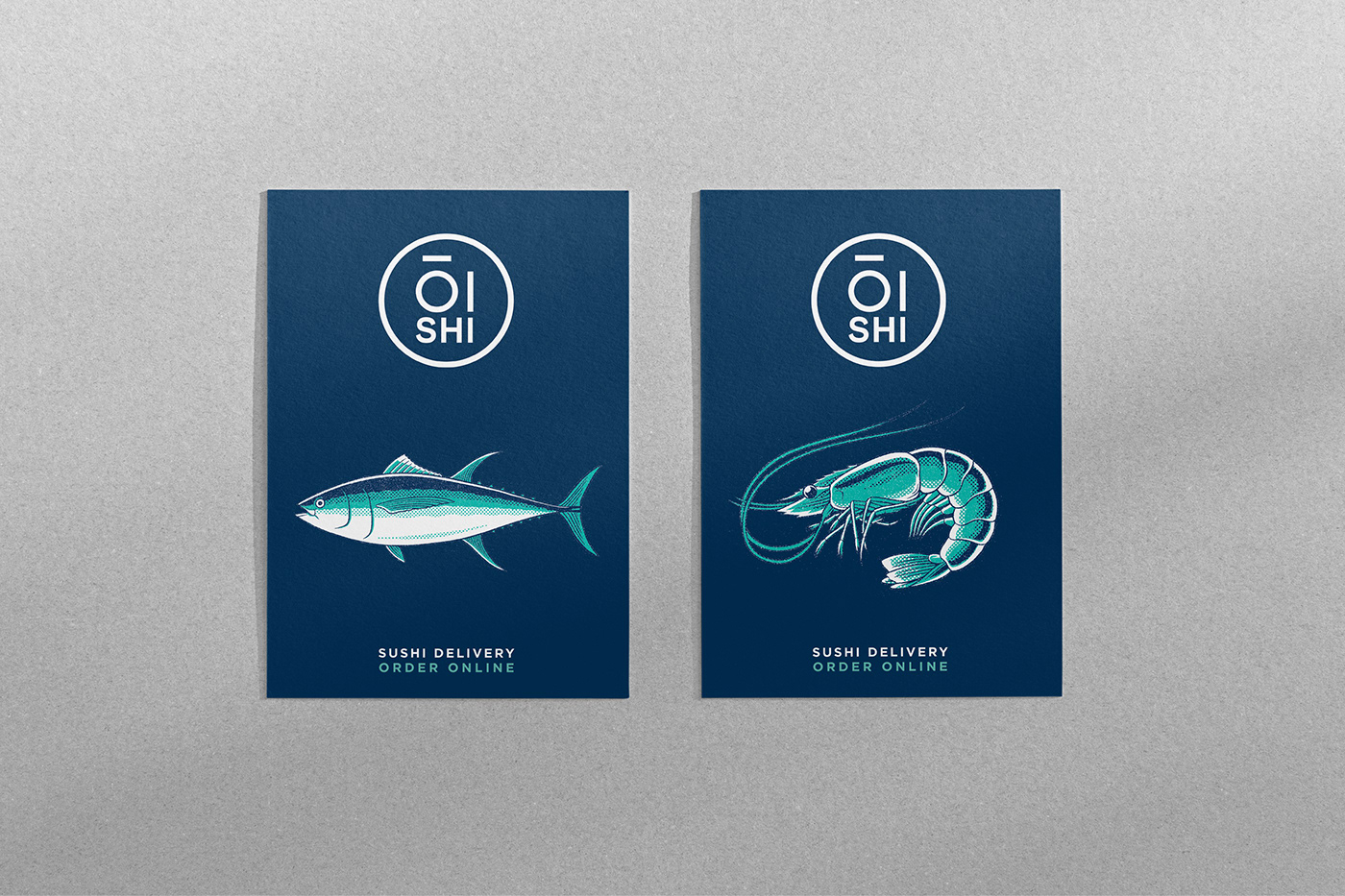
Oishi isn't just a brand; it's a statement—a testament to the harmonious fusion of taste, sustainability, and style. With our redesign, Oishi emerges as a beacon of innovation and responsibility, setting a new standard in the culinary landscape. From its eco-conscious packaging to its unmistakable brand identity, Oishi embodies a commitment to excellence that is both timeless and forward-thinking.
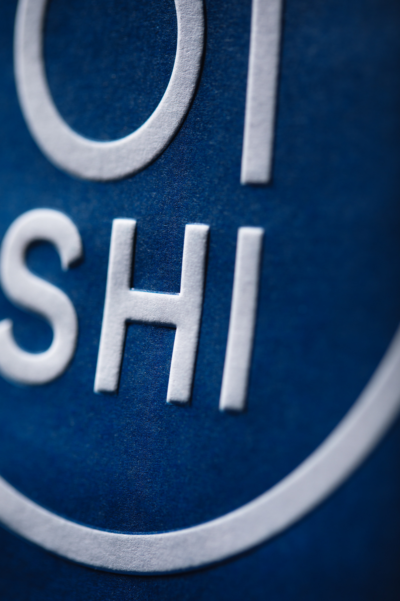
Oishi—where sustainability meets sophistication.
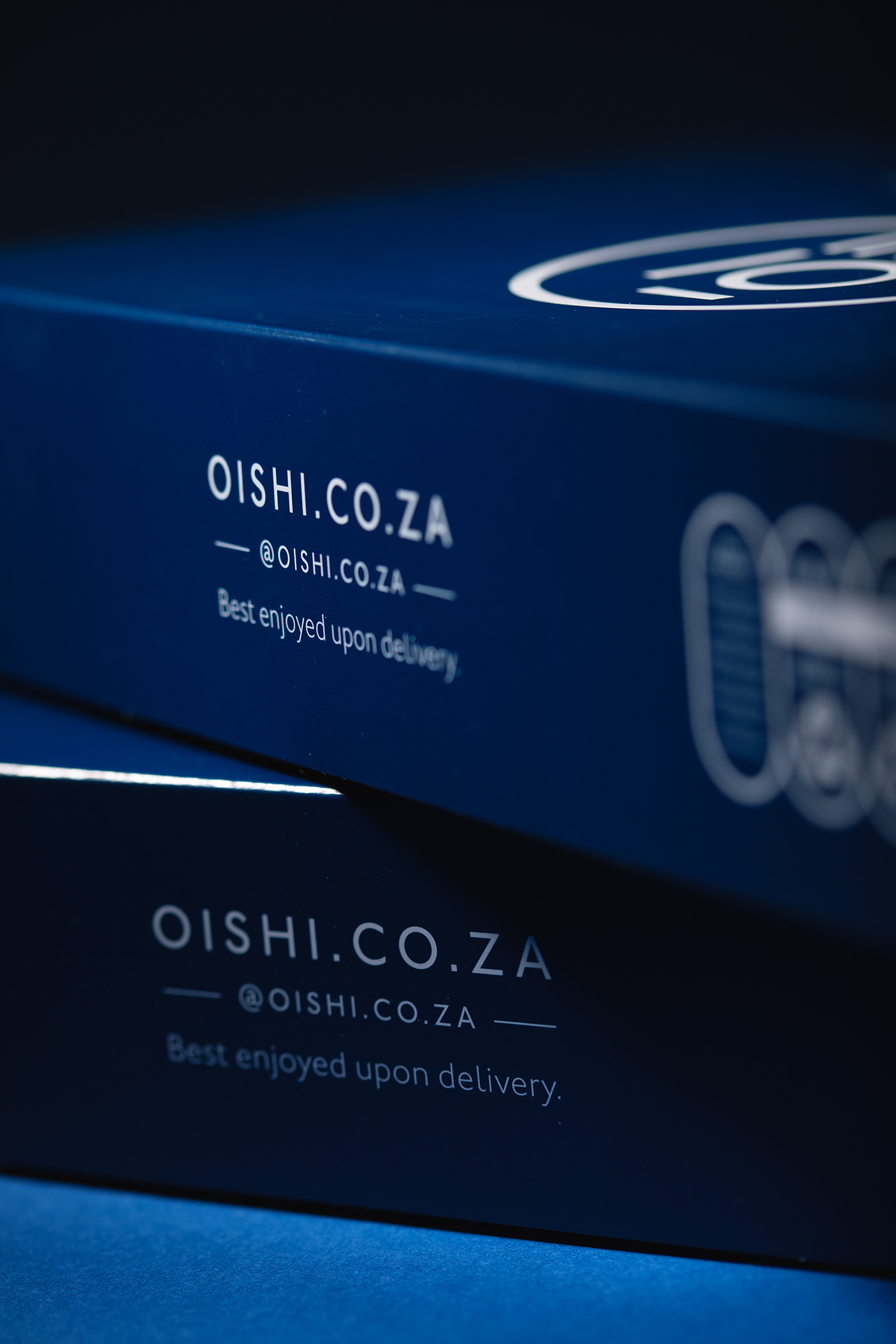
Carefully crafted packaging was the cornerstone of our design strategy. Each element was meticulously designed to accommodate diverse sushi orders seamlessly, ensuring a delightful and hassle-free dining experience for customers. From traditional rolls to avant-garde creations, our packaging solutions catered to every culinary delight with elegance and efficiency.
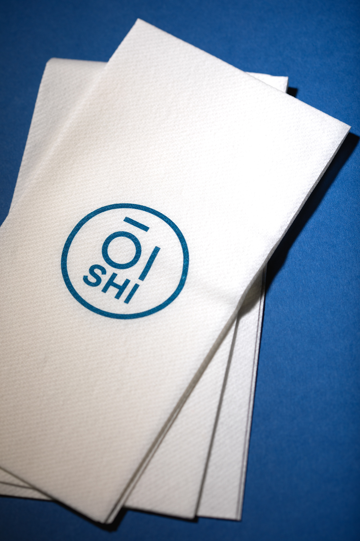

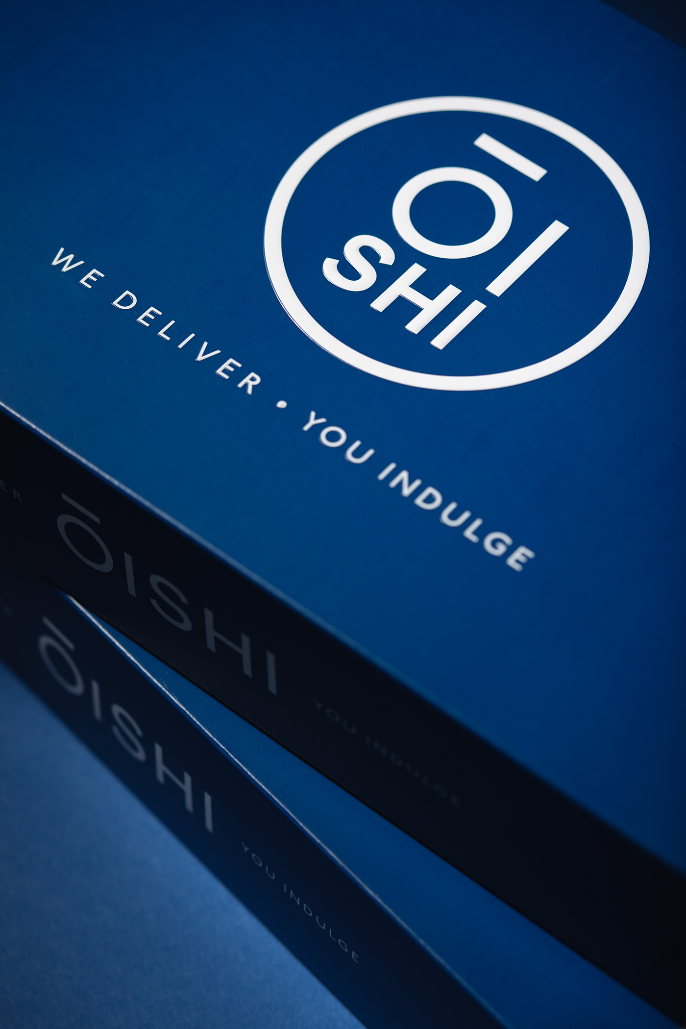
The redesign aimed to reinforce Oishi's status as a culinary icon while infusing it with a fresh, contemporary allure. Our team meticulously curated every aspect of the brand's visual identity, from the logo to the color palette, ensuring that Oishi remained instantly recognisable and synonymous with excellence in every detail.